GO DESi
When GO DESi approached us for the rebrand, they were in the process of expanding their reach into new geographies and introducing new product categories. Since the brand started and became popular with their iconic product Desi-Popz, they wanted to move away from their image of just a nostalgic candy brand and had a vision to become a multi- category brand with much larger product offerings.
Old Packaging

The New Identity
We came up with an identity which is desi by heart, reflects authenticity & resonates with the wider new audience. We crafted the modern yet rooted design language which appeals to all age groups and flows consistently across product categories.

Brand Personality
Confident and DESi by heart
Embraces the true identity
Modern yet rooted
Authentic yet new-age
Brand Symbolism
Blast of flavours
Starburst
Excitement & Joy
Multiple offerings

Brand Assets
The identity extends into graphic brand patterns, inspired from Indian border art. It adds character to the brand and is used across product categories as a design element.
The vibrant colour palette and bold line art illustrations create a unique look for each product category and a distinct look within the GO DESi Portfolio.
Additional brand icons and illustrations were made to represent GO DESi’s initiative to support job creation & entrepreneurship in rural India.


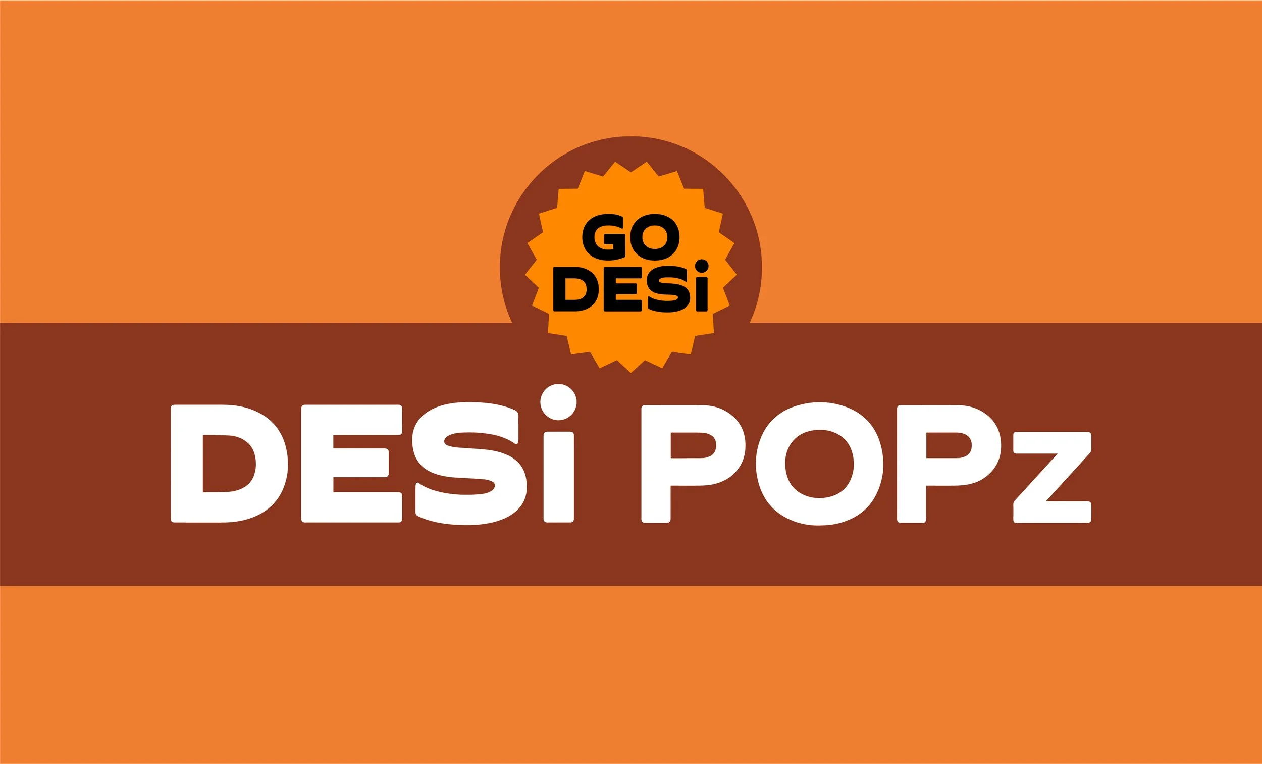
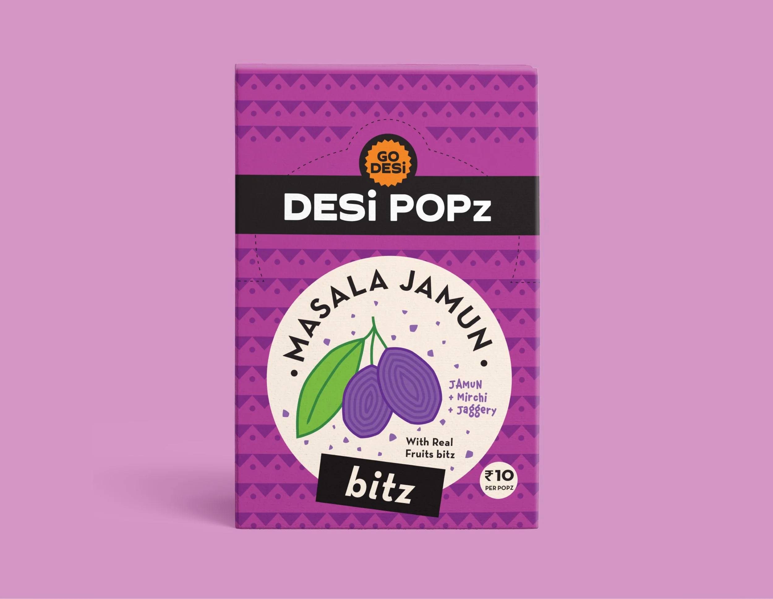
DESi POPz
DESi POPz is one of the key category’s of GO DESi. A desi lollipop which is tangy, flavourful, and made from traditional recipes using natural ingredients.
Illustration units are created in a bold line art style with an idea of ‘blast of flavours’.
The vibrant colour palette of DESi POPz creates a distinct look for each product.
Desi POPz boxes are designed in a way that they’re self collapsible, and turn into a counter candy dispenser at selling point. The packaging communicates each flavour effectively through vibrant colours, brand patterns and illustration units.


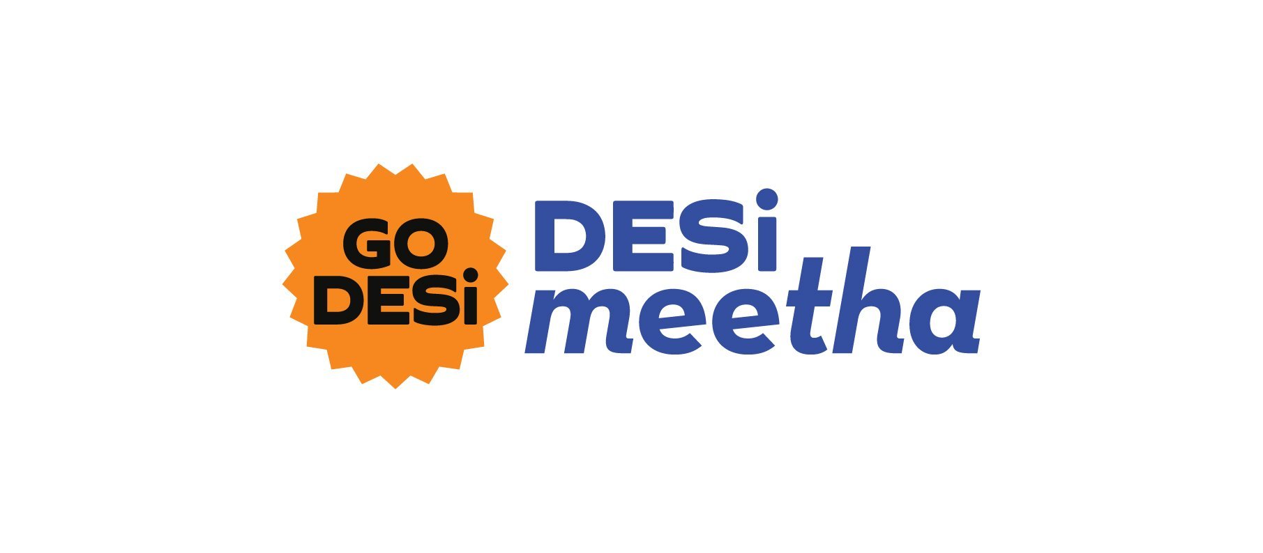
DESi meetha
DESi Meetha is a healthy traditional barfi made with jaggery, coconut, and nuts.
The brand pattern is used in a creative way to form the unit with typography that highlights the flavour. The striking blue colour gives the category an attractive, memorable look and stands out on shelves. The design approach continues the overarching concept of ‘blast of flavours’ with a non-traditional, contemporary look.


Special Edition Packs
DESi meetha Bro-Sis Pack is designed with the concept of ‘This is so Us’ to connect every brother & sister and make them reminisce fun times spent together. This pack celebrates moments of happiness, love and care between siblings.
GO Desi Trial Pack includes samples from all the product categories. The pack design evokes nostalgia and is inspired from ‘Desi Toffee shop’ where the toffees were kept in glass jars ‘Barni’.


